
Effective color palette ideas to inspire your next graphic design project
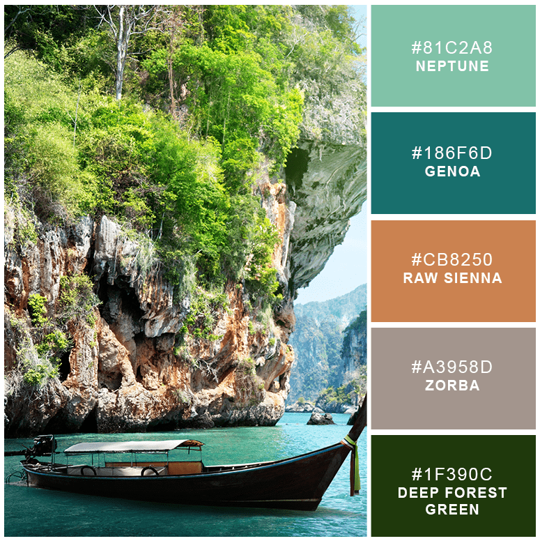
1. Hidden Treasures
This green-based palette is both rich and calming. By adding the light tan-based Zorba, the tawniness of Raw Sienna is kept low-key. Hidden Treasures would be an excellent palette for any company associated with nature or the outdoors.
This green-based palette is both rich and calming. By adding the light tan-based Zorba, the tawniness of Raw Sienna is kept low-key. Hidden Treasures would be an excellent palette for any company associated with nature or the outdoors.
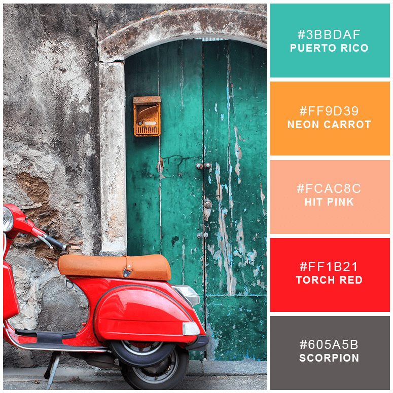
2. Neon Pop
The vibrancy of Torch Red, Neon Carrot and Puerto Rico are calmed and offset by the peachy pink and dark gray hues. Much like a brilliant billboard or poster hung on a solid stone wall, Scorpion grounds and upholds these other colors that tend to pop from the page.
The vibrancy of Torch Red, Neon Carrot and Puerto Rico are calmed and offset by the peachy pink and dark gray hues. Much like a brilliant billboard or poster hung on a solid stone wall, Scorpion grounds and upholds these other colors that tend to pop from the page.
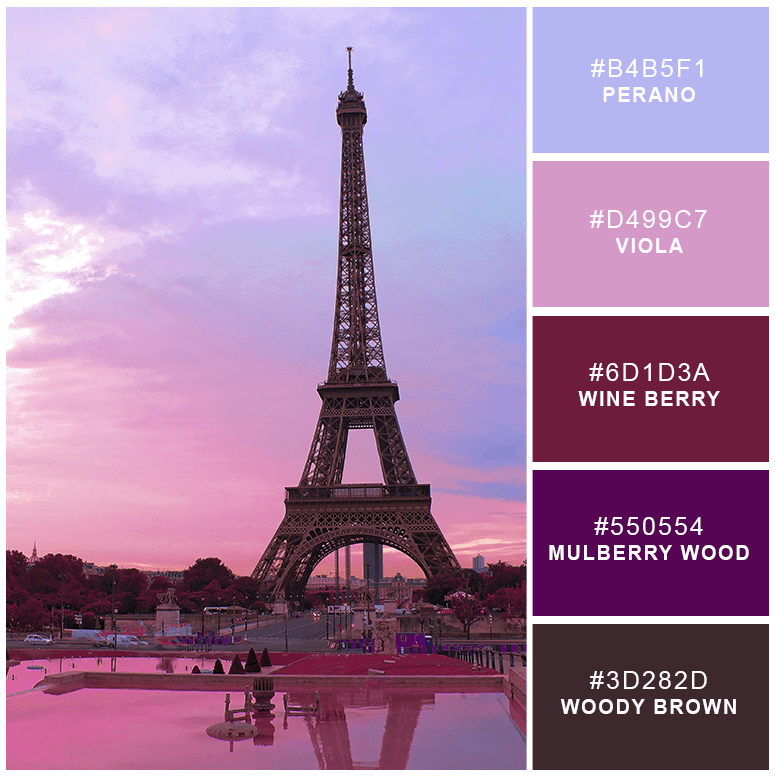
3. Paris Interlude
Monochromatic colors taken from the same hue are great for understated looks, but these brilliant purple shades will keep your design punched up and exciting. Even the deepest Woody Brown hue has a hint of violet, evoking a deep sunset over a wooded area.
Monochromatic colors taken from the same hue are great for understated looks, but these brilliant purple shades will keep your design punched up and exciting. Even the deepest Woody Brown hue has a hint of violet, evoking a deep sunset over a wooded area.
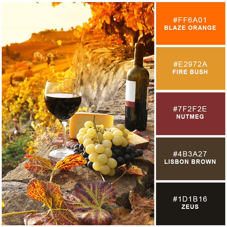
4. Golden Autumn Glory
Autumn colors are bright and invigorating, and this palette creates a similar energy. Perfect for companies wanting feelings of coziness or for those dealing with the outdoors, this beautiful palette combines blazing colors with a rich wine-based hue. Although bright, you can keep the colors toned down by using Zeus for your text, Fire Bush for your background and the other three hues for graphic flourishes.
Autumn colors are bright and invigorating, and this palette creates a similar energy. Perfect for companies wanting feelings of coziness or for those dealing with the outdoors, this beautiful palette combines blazing colors with a rich wine-based hue. Although bright, you can keep the colors toned down by using Zeus for your text, Fire Bush for your background and the other three hues for graphic flourishes.
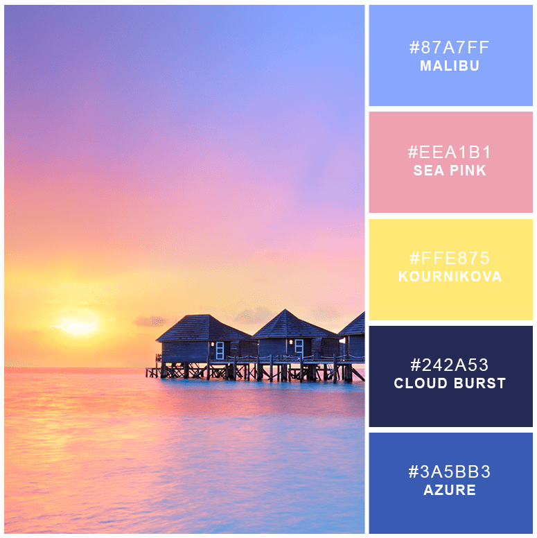
5. Pacific Sunrise
A brilliant pastel sunrise fills you with energy and excitement for the day, and this palette will get your customers excited about your brand. Although the colors are bright, they are perfect for softlines or children’s brands.
A brilliant pastel sunrise fills you with energy and excitement for the day, and this palette will get your customers excited about your brand. Although the colors are bright, they are perfect for softlines or children’s brands.
6. Caribbean Welcome
If you want to evoke adventure and imagination, this palette is a great place to begin. Each complementary color is crisp and bright, capturing the mind and exciting the emotions. Reminiscent of the brilliantly painted homes and shops on the shores of the Caribbean, these colors create a vacation-like quality of exuberance.
If you want to evoke adventure and imagination, this palette is a great place to begin. Each complementary color is crisp and bright, capturing the mind and exciting the emotions. Reminiscent of the brilliantly painted homes and shops on the shores of the Caribbean, these colors create a vacation-like quality of exuberance.

7. Winter’s Fog
The monochromatic hues of gray and black are offset in this palette by the sheer yellow of Milan. Much as the sun peeks through snow-covered trees on a crisp winter’s day, Milan will peek through your graphics, showing your customers that your brand does have a heart and soul while welcoming them to try your business.
The monochromatic hues of gray and black are offset in this palette by the sheer yellow of Milan. Much as the sun peeks through snow-covered trees on a crisp winter’s day, Milan will peek through your graphics, showing your customers that your brand does have a heart and soul while welcoming them to try your business.

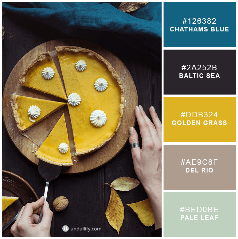
8. Rich November
Chathams Blue is an incredibly rich color, commonly seen on intensely dyed linens. Combined with the complementary shade of Golden Grass, these luxurious hues warm the mind. This palette would provide an exciting twist for a neighborhood shop, antique store or luxury goods brand. Use Del Rio as your background and Baltic Sea for your text, and your design will be completely set.
Chathams Blue is an incredibly rich color, commonly seen on intensely dyed linens. Combined with the complementary shade of Golden Grass, these luxurious hues warm the mind. This palette would provide an exciting twist for a neighborhood shop, antique store or luxury goods brand. Use Del Rio as your background and Baltic Sea for your text, and your design will be completely set.
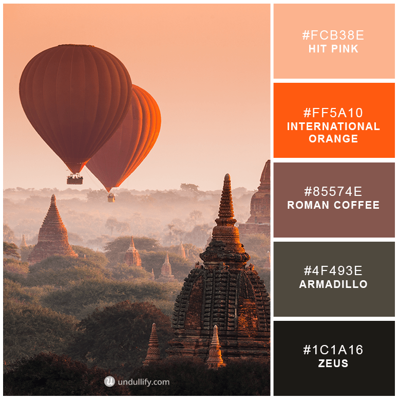
9. International Flight
Traveling the world brings adventure and warmth to the soul, much as this color palette does. While Armadillo and Zeus anchor your brand to the world, Hit Pink and International Orange help you to soar. The ideal palette for an adult brand, International Flight is smart and sophisticated yet edgy.
Traveling the world brings adventure and warmth to the soul, much as this color palette does. While Armadillo and Zeus anchor your brand to the world, Hit Pink and International Orange help you to soar. The ideal palette for an adult brand, International Flight is smart and sophisticated yet edgy.
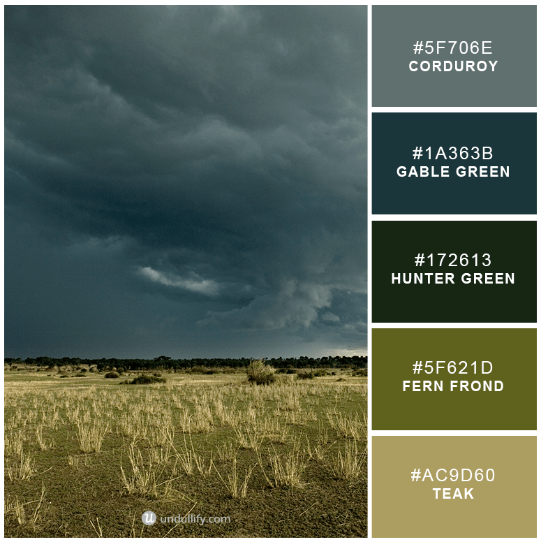
10. Building Storm
The two most natural colors are green and blue, which hearken back to earth and sky. This natural palette keeps away from the softness of a pleasant day and instead pulls on the emotions with sensuous and strong colors. Consider this for a masculine or an outdoors brand.
The two most natural colors are green and blue, which hearken back to earth and sky. This natural palette keeps away from the softness of a pleasant day and instead pulls on the emotions with sensuous and strong colors. Consider this for a masculine or an outdoors brand.
11. Mexican Waters
Cool and refreshing like a day along the seashore, this palette gives you an array of blues that hint at nearly every mood. Considered to be a color that is linked to dependability, blue-themed palettes work well for travel, health care and communication brands.
Cool and refreshing like a day along the seashore, this palette gives you an array of blues that hint at nearly every mood. Considered to be a color that is linked to dependability, blue-themed palettes work well for travel, health care and communication brands.

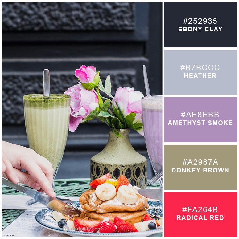
12. Saturday Brunch
Filled with sophistication and elegance with a pop of Radical Red to ease any tension, Saturday Brunch is a motivating palette ideal for showing off your brand’s determination. Consider this palette for food-related brands, such as restaurants and food processing companies.
Filled with sophistication and elegance with a pop of Radical Red to ease any tension, Saturday Brunch is a motivating palette ideal for showing off your brand’s determination. Consider this palette for food-related brands, such as restaurants and food processing companies.
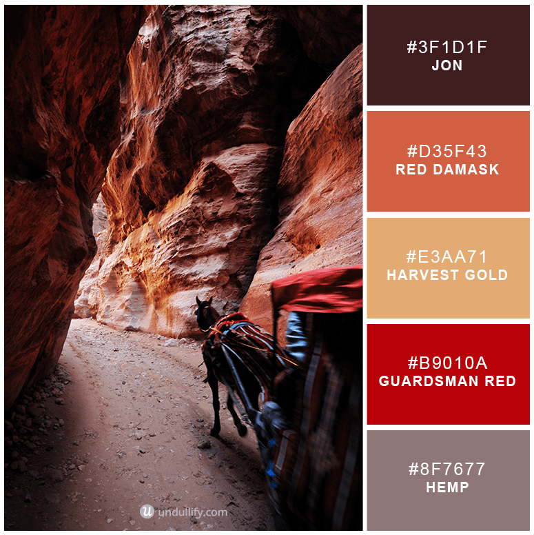
13. Old West
The earthy colors here point to a brand this is incredibly grounded and aware of its customers. However, this palette is not afraid to take a risk with Guardsman Red. Although intense, these colors are also inviting and work particularly well for the wine or beverage industry.
The earthy colors here point to a brand this is incredibly grounded and aware of its customers. However, this palette is not afraid to take a risk with Guardsman Red. Although intense, these colors are also inviting and work particularly well for the wine or beverage industry.
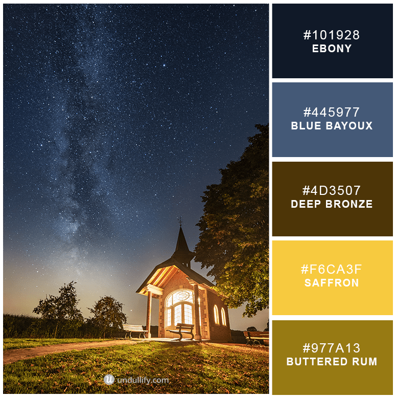
14. North Star
The cheerfulness of Saffron and Buttered Rum are joined with the calming presence of Ebony and Blue Bayoux to lead you to your true north. While this is certainly a unique grouping of colors, each is very grounding, and the entire palette displays your trustworthy presence to your customers.
The cheerfulness of Saffron and Buttered Rum are joined with the calming presence of Ebony and Blue Bayoux to lead you to your true north. While this is certainly a unique grouping of colors, each is very grounding, and the entire palette displays your trustworthy presence to your customers.
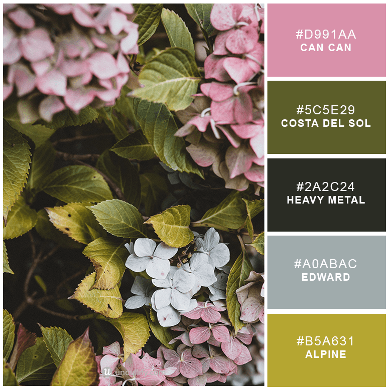
15. Spring Flowers
While these colors are more feminine, especially with the addition of the sweetly colored Can Can, they lack the saccharine quality that would make men look down on them. These are the perfect colors for a flower shop or even a neighborhood bakery.
While these colors are more feminine, especially with the addition of the sweetly colored Can Can, they lack the saccharine quality that would make men look down on them. These are the perfect colors for a flower shop or even a neighborhood bakery.
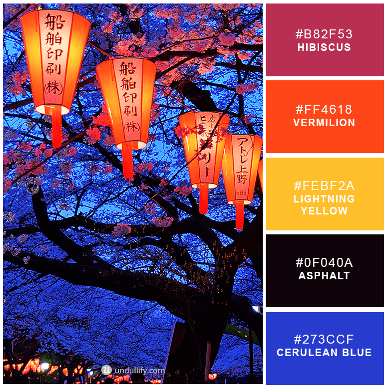
16. Stained Glass Window
This palette cannot fail to catch your eye. With mainly rainbow hues, Asphalt anchors the other colors. Stained Glass Window catches the attention while proclaiming you as a passionate, extroverted, customer-centric company.
This palette cannot fail to catch your eye. With mainly rainbow hues, Asphalt anchors the other colors. Stained Glass Window catches the attention while proclaiming you as a passionate, extroverted, customer-centric company.
17. Casual elegance
This is a crisp, casual and elegant combination that will suit all graphic design projects. Consider only using the salmon pink as a highlight color for a more dramatic effect.
18. Cosy French
A cosy combination of blues and purples, this muted palette will remind you of a country French farmhouse on a cold winter's night. A perfect alternative to use during seasonal changes of Spring or Autumn and stand out from the crowd.
A cosy combination of blues and purples, this muted palette will remind you of a country French farmhouse on a cold winter's night. A perfect alternative to use during seasonal changes of Spring or Autumn and stand out from the crowd.
19. Mid-century classic
Always stylish, these mid-century inspired colors are timeless no matter what the current color trends are.
Always stylish, these mid-century inspired colors are timeless no matter what the current color trends are.
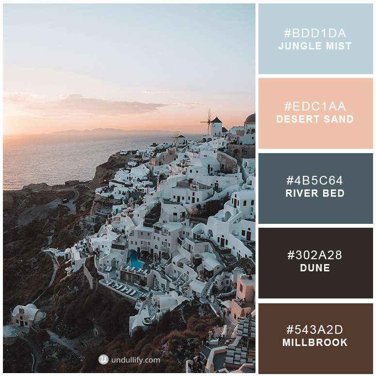
20. Sleepy Sedona
These are the pastels of the Arizona dessert where it meets up with lazy cities surrounded by sand and saguaros. While these colors are tranquil and soothing, they still speak volumes as lighter blue stands for communication and mental clarity. Consider using this for an organic brand or for a health and beauty-based company.
These are the pastels of the Arizona dessert where it meets up with lazy cities surrounded by sand and saguaros. While these colors are tranquil and soothing, they still speak volumes as lighter blue stands for communication and mental clarity. Consider using this for an organic brand or for a health and beauty-based company.

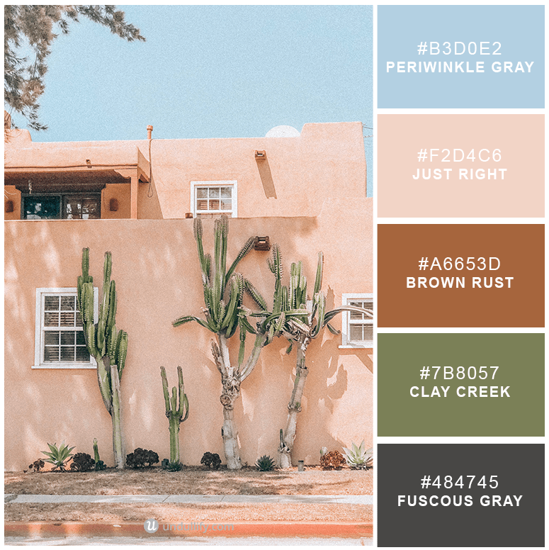
21. Old Arizona
On the edgier side of the western dessert is this Old Arizona palette, which combines the Periwinkle Gray of cloudless days with the traditional stucco color of Just Right. These colors invite the eye to linger and give off a sense of relaxation, which is exactly what a company in the hospitality industry would need to succeed.
On the edgier side of the western dessert is this Old Arizona palette, which combines the Periwinkle Gray of cloudless days with the traditional stucco color of Just Right. These colors invite the eye to linger and give off a sense of relaxation, which is exactly what a company in the hospitality industry would need to succeed.
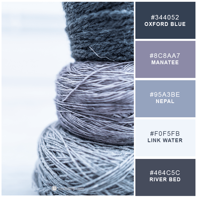
22. Industrial Grays
Dark and stormy, this collection of grays and deep browns reminds you of a steel-framed industrial space and of strength and confidence. Clearly, these are amazing colors for an industrial company or a construction brand that wants to position itself as being the solid choice.
Dark and stormy, this collection of grays and deep browns reminds you of a steel-framed industrial space and of strength and confidence. Clearly, these are amazing colors for an industrial company or a construction brand that wants to position itself as being the solid choice.
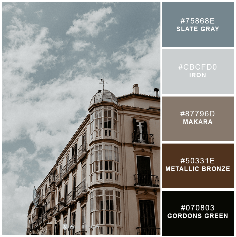
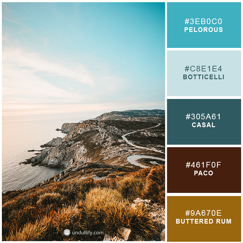
23. Gathering Storm
These shades of blue are both powerful and evocative, calling to a place deep within one’s soul. Waikawa Gray and Casper both speak of trust and stability, while Horizon and Taupe take this palette to an even more sophisticated level. These dark and masculine tones could work well for the finance industry.
These shades of blue are both powerful and evocative, calling to a place deep within one’s soul. Waikawa Gray and Casper both speak of trust and stability, while Horizon and Taupe take this palette to an even more sophisticated level. These dark and masculine tones could work well for the finance industry.


No comments
Post a Comment